The Architecture Of The Fair: Lighting and Color
Historical Essay
by Gray Brechin
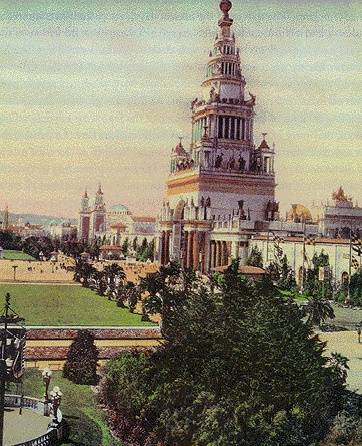
The Tower of Jewels displaying its graceful colors during the day.
<iframe src="https://archive.org/embed/StoryofJ1915" width="640" height="480" frameborder="0" webkitallowfullscreen="true" mozallowfullscreen="true" allowfullscreen></iframe>
Video: courtesy Prelinger Archives
| Gray Brechin describes the unique uses of indirect lighting at the Panama Pacific International Exposition and examines Jules Guerin’s selection of colors to reflect the California landscape in the fair’s architecture; a stark contrast to the tradition of the Great White City started by the Chicago World’s Columbian Exposition (1893). |
LIGHTING
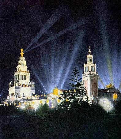
While previous fairs had used outline lighting with bare bulbs on building exteriors (a technique frequently used for advertising in theaters and commercial structures at the time), the Panama Pacific International Exposition was the first exposition to make general use of indirect lighting and was generally agreed to be loveliest at night. Walter D'Arcy Ryan, director of the illuminating laboratory of the General Electric Company at Schenectady, New York, supervised all illumination, creating numerous theatrical effects. Tall Venetian masts topped with shields and banners directed light from powerful magnesite arcs at the walls of the palaces, bathing them with a soft, shadowless radiance. Perfect reflections were thus assured in still pools in the courtyards. Searchlights on the roofs of the palaces and the towers raked the sky and spotlighted heroic sculpture on the skyline, casting their silhouettes through the fog. The Scintillator, a battery of forty-eight searchlights off the Marina manned by a company of marines, executed precise drills every night, weaving artificial auroras in the fog or, on clear nights, animating clouds of steam lofted by a stationary locomotive.
Each court had its distinctive nocturnal color scheme: underwater lights in the Court of the Seasons created glowing green pools; the fountains in the Court of the Universe were a stellar white; while the Court of the Ages featured infernal red. This most theatric of all the courts also featured "altars" decorated with writhing serpents from which rose clouds of red steam. In the Court of the Universe, Adolph A. Weinman's statues of "The Rising Sun" and "The Setting Sun" were mounted on sixty-foot columns of dense glass that glowed soft white at night.
The enormous green glass dome of the Palace of Horticulture became radiant after dark as the light of another battery of searchlights hidden in its tropical shrubbery was projected upward against the underside of the dome through revolving lenses and colored screens, simulating an immense fire opal. But the most spectacular effects were reserved for the 432-foot Tower of Jewels, the centerpiece and portal of the walled city. Its arch was larger than the Arc de Triomphe and its step-backed tower, heavy with military trophies and crowned with a great armillary sphere, easily topped the backdrop of Pacific Heights and made it visible throughout the Bay Area. The Tower was hung with over 102,000 "Novagems," large faceted and colored glass "Jewels" backed with mirrors and hung by wires to gyrate and flash with every breeze. Concealed lights and nearby searchlights suffused it with what was described as a "living film of light." Frank Morton Todd, the official historian of the fair, described the special effect known as "The Burning of the Tower," which symbolized the burning of San Francisco in 1906:
Concealed ruby lights, and pans of red fire behind the colonnades on the different galleries, seemed to turn the whole gigantic structure into a pyramid of incandescent metal, glowing toward white heat and about to melt. From the great vaulted base to the top of the sphere, it had the unstable effulgence of a charge in a furnace, and yet it did not melt, however much you expected it to, but stood and burned like some sentient thing doomed to eternal torment! 8
On a somewhat happier note, the Novagem Jewel Company published a doggerel tribute to the wondrous tower:
Oh! Tower of Jewels so wondrously bright
Thy Novagems sparkling by day and by night
Flashing their fame o'er the land and the sea
Jewel City -- 1915 -- P.P.I.E.! 9
COLOR
While local color had been used in previous fairs (notably at Buffalo and St. Louis), the dominant impression was of whiteness. "The Great White City" of 1893 at Chicago had, after all, come as a revelation of apparent hygiene and order to Americans of "the Brown Decades" and had wrought a revolution in architectural color. Probably the most remarked feature of the Panama Pacific International Exposition was the wholesale use and coordination of color under the direction of Jules Guerin. At the time, Maxfield Parrish and Guerin were renowned for their romantic watercolors and were considered the foremost color specialists of their age. Guerin was early called upon to coordinate all colors in the fair and worked closely with architects, painters, sculptors, gardeners and lighting experts. Architects' line drawings to be used as guides for the painting and plastering of the palaces were sent to Guerin, who painted them with his deft, late-Impressionist technique. His thoroughness was remarkable; he worked with John and Donald McLaren to harmonize flowerbeds with adjacent walls, designed uniforms and banners, and even had the sugary Monterey sand on the footpaths roasted to a rich cinnamon brown.
The color scheme was meant as a joyous celebration of the California landscape. The leonine Coast Range hillsides, tawny with dry grass for much of the year, had first shocked immigrants from wetter climates. "In the early days," noted novelist Mary Austin, "when all the West was full of belt-loosening, breath-easing sound as men accommodated themselves to its largeness, the color of California was a thing to make one gasp. It affronted the puritan temperament with its too abundant charm...."10 "Bleak," "terrible" and "barren" were adjectives commonly used to describe the strange, treeless land. By the turn of the century, however, with the comforts of urban civilization readily available, the color and form of the landscape were increasingly appreciated and touted. Hardly an issue of the Overland Monthly or Sunset Magazine lacked the almost obligatory paean to the humble California poppy that then covered hillsides in far greater profusion than today. George Sterling's empurpled poems, in particular, are heavy with coloristic excess. "Gold" was the favored adjective to describe the terrain and its products; Robert Reid's murals in the coffered dome of the Palace of Fine Arts rotunda symbolically illustrated the four golds of California-gold, wheat, oranges and, of course, poppies.
Mary Austin saw the exposition as the natural outgrowth of the Western environment:
[The West] has made this exposition the richest dyed, the patterned splendor of all their acres of poppies, of lupines of amber wheat, of rosy orchard, and of jade-tinted lakes. Beside a sea which runs from lion color to chrysoprase and sapphire blueness, they have laid down a building scheme which is as bright as an Indian blanket. 11
Fully aware, as were architects of the time, that classical architecture had not originally been white, as the Chicago fair was, Austin noted that one would have to "hark back to the days of Pompeii and the Greco-Roman splendor to find its like," but that even such a comparison was insufficient, "for the color of California is to the color of Italy as a rose is to its pressed remembrance in a book."12
Jules Guerin himself wrote that the landscape was his inspiration:
I saw the vibrant tints of the native wild flowers, the soft brown of the surrounding hills, the gold of the orangeries, the blue of the sea; and I determined that, just as a musician builds his symphony around a motif or chord, so must I strike a chord of color and build my symphony on this.13
Architect William Woolett was nearly unhinged by the spectacle:
No greater Roman holiday was ever made than this. Shades of Stanford White stalk nightly in this wonder place, where the gemmed star maidens look down on dusky sisters clothed in Oriental sepia. The dead spleen of Vitruvius should gather grit to see so lordly a scheme go through the color pots. Yellow domes atop these classic piles proclaim against the cerulean blue in unmistakable paean, "Who did this thing?"14
Hand-tinted photographs suggest that the fair was a garish display of pinks, blues, orange and red. Primitive color films suggest more muted harmonies entirely in keeping with Guerin's watercolors. Frank Morton Todd's description of the Palace of Fine Arts gives some idea of the tonality of the exposition:
The columns of the peristyle were pale green, the groups of four [columns] were ochre. The wall of the gallery was Pompeian red, with a vine covered pergola overhead. The dome of the rotunda was burnt orange with a turquoise green border. Below its panels an attic of green marble.15
--by Gray Brechin, (from "Sailing to Byzantium: The Architecture of the Fair" in The Anthropology of World's Fairs, edited by Burton Benedict)
The Tower of Jewels, illuminated at night.


