The Architecture Of The Fair: The Court Plan
Historical Essay
by Gray Brechin
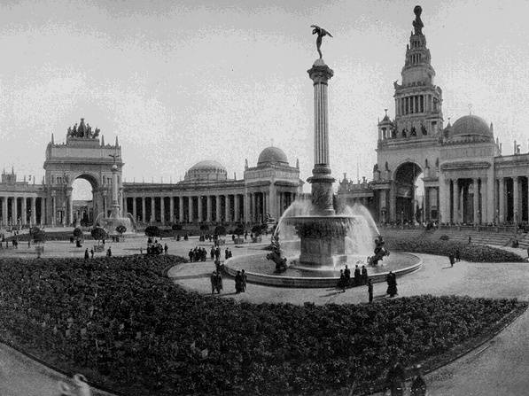
The Court of the Universe, featuring the Arch of the Rising Sun (at left rear) surmounted by the group of sculptures "The Nations of the East."
Ernest Coxhead devised one of the most brilliant layouts ever created for a world's fair. Since the 1893 Chicago exposition, world's fairs had been laid out as typically beaux-arts ensembles of classically-derived buildings in a formal landscape ordered by major and minor axes. Such planning formed the basis of much City Beautiful thought and can best be seen in the San Francisco Civic Center, whose French Renaissance-inspired buildings are arrayed around the central axis of Fulton Street. At the Panama Pacific International Exposition, however, eight major exhibition palaces were tightly arranged around three major inner courts and five minor forecourts. The seventy-foot walls of the buildings thus broke the westerly wind and gave shelter to pedestrians. This compact plan, in which space becomes the positive element and buildings simply a neutral infill, greatly lessened the walking distance that had been such a liability of the sprawling St. Louis fair in 1904. Architects were given courts rather than buildings to design: the firm of McKim, Mead and White created the central Court of the Universe, Louis Christian Mullgardt the Court of the Ages, renamed the Court of Abundance, and Henry Bacon the Court of the Seasons. They were thus responsible only for the exteriors of four buildings, while the structures themselves (simply huge industrial sheds) were produced by the exposition engineering department. George Kelham designed the smaller Courts of Flowers and Palms opening off the South Gardens with their flanking Italian Towers, while W. B. Faville was in charge of the outer walls with their embellished portals and half-domes.
The official historian of the fair noted that "adornment commonly associated with interiors of buildings was lavished on the exterior to make these courts, so that it was said that the plan presented the aspect of an Exposition 'turned inside-out.' So distinct was this appearance, that it inspired one commentator of usually powerful vision to see in it a tendency towards an invasion of fourth-dimensional space." 6 Outside of this tight core, individual buildings--the Horticulture and Festival Halls and the Palaces of Machinery and Fine Arts--were arranged more conventionally in relation to the major and minor axes of the fair, but their domes related to the domes in the skyline of the inner fair. Beyond this, order fell off considerably; state and national pavilions fanned out west of the Palace of Fine Arts in the Presidio, beyond which was a loose grouping of livestock buildings and racetracks, while the Zone offered its visual chaos of amusements around Fort Mason.
The Panama Pacific International Exposition was thus organized in three roughly concentric bands: a tight inner core of palaces and courts, a secondary band of individual buildings and gardens and a loose outer perimeter of amusements and area concessions. It is the first two, and the remarkable core in particular, that constituted the "City of Domes" or "Jewel City." Noting that the plan of the buildings should be as agreeable as the buildings themselves, the beaux-arts-trained Bernard Maybeck wrote:
If the plan of the Panama-Pacific International Exposition group of main buildings were reduced in scale to the size of a golden brooch and the courts and buildings were made of Venetian cloisonn jewelry, the brooch thus made would pass as the regular thing in Jewelry without causing the suspicion that it represented a plan for a World's Fair. 7
--by Gray Brechin, (from "Sailing to Byzantium: The Architecture of the Fair" in The Anthropology of World's Fairs, edited by Burton Benedict)

