Public Housing Comes Full Circle: Difference between revisions
(swapped photos) |
No edit summary |
||
| Line 113: | Line 113: | ||
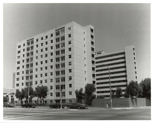
[[Image:Block-431-housing-project-north-beach.jpg]] | [[Image:Block-431-housing-project-north-beach.jpg]] | ||
'''Block 431, North Beach Housing Project before Hope VI renovation | '''Block 431, North Beach Housing Project before its demolition a few years ago as part of the Hope VI renovation.''' | ||
Highrise housing on tight lots has proliferated for elders over the years. More generous unit cost limits have increased amenities; creative siting and scaled-back massing soften their interface with smaller-scaled neighborhood residences. Two striking examples: | Highrise housing on tight lots has proliferated for elders over the years. More generous unit cost limits have increased amenities; creative siting and scaled-back massing soften their interface with smaller-scaled neighborhood residences. Two striking examples: | ||
Revision as of 21:49, 14 September 2009
Historical Essay
by Diana Scott
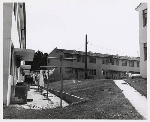
Sunnydale courtyard, 1964.
Photo: San Francisco History Center, SF Public Library
First came rejection of crowded, land-eating row houses of urban industrial slums. Government-built garden apartments of the '40s reflected an infatuation with grassy, sunlit courtyards, shared laundries and play spaces. Then followed the mega-highrise phase of the '50s and '60s, which was in turn eclipsed by salvage and rehab in the '70s and '80s. Finally, in the '90s, the "faux private" row house has emerged as the ideal.
So in its 50 years, federal housing design philosophy has brought us full circle. But is the new all good? And does that make the old uniformly bad?
DEMOLITION AND REPLACEMENT
Demolition carries a high profile these days. It was virtually banned until just 18 months ago, when a requirement to rebuild an equivalent number of replacement units on site was lifted—contingent on off-site relocation assurances.
San Francisco's much-praised prototype for public housing demolition and redesign is Robert B. Pitts, the neo-Victorian townhouse complex at Turk and Scott streets in the Western Addition, built in 1991 and designed by ED2 of San Francisco and Community Design Center of Oakland. The downscaled 203-unit (2- to 4-bedroom) complex replaced 332 apartments of its highrise predecessor, Yerba Buena Plaza West.
According to Peter Wong, a principal at ED2, this breakthrough project design—attached two-story, vinyl-sided "faux private" townhouses with separate entrances and shared interior recreation courts—was the by-product of an intensely interactive, seven-year process whose initial goal was rehab.
Workshops, town meetings with residents and housing officials, interviews with residents and a competition among children to design a playground were all part of the design process.
While the rehab plan was ultimately scrapped, the ideas informed the new building and site design, producing toddler play areas within window-view of residences, apart from concrete surfaces, sand fleas and basketball hoops for teens. Design features invite gathering in some areas and discourage it in others, says Wong. Four years after its opening, Pitts still looks new. "Tenants saw the project as their own, didn't try to take their frustration out on the buildings," he says.
Despite comparable costs of rehab and new construction, available federal funding—augmented with $2 million from the Mayor's Office of Community Development— ultimately tipped the scale. "In public housing, form follows finance," quips Wong.
The high cost of centralized maintenance was another key factor: "Units are now zoned in a way that you don't need to shut down several units to repair something," he says. Centralized maintenance costs are high.
YERBA BUENA PLAZA EAST REPLACEMENT
Neither the ideal behind Pitts—a hybrid model of separate, Victorianesque apartments and shared, structured open space—nor the shelved highrise rehab plan for Yerba Buena Plaza West will be applied to nearby Yerba Buena Plaza East, its twin, slated for demolition. Under the new HUD Hope VI program—that funds demolition and new construction for troubled public housing complexes—the megablock on which the apartment house stands will be subdivided into component blocks of row house walk-ups. Separate backyards, accessible only through individual dwellings, will eliminate shared open space entirely.
Marquis Associates, along with Powell & Partners, has received the commission for designing these replacement units. Gita Dev of Marquis envisions the possibility of a three- or four-bedroom family unit by building up on a narrow lot.
SALVAGE AND REUSE
Whatever the pros and cons of proposals to demolish and rebuild up to a half dozen San Francisco public housing projects—inhabited predominantly by families of color—demolition itself is a catastrophic event, something like an earthquake. It eradicates forever one's most familiar landscape, with its personal landmarks linked to key life history events. It disrupts—if only temporarily—accustomed patterns of social interaction.
Even in the best-case scenario—a better-designed replacement dwelling for each family—transitions can be traumatic. Worrisome, too: The new subsidized version of the American Dream hinges on adequate multi-source funding and surplus administrative savvy, about which informed observers express skepticism. The worst-case scenario is unthinkable: The loss to families of shelter itself. To prevent this, Congress requires that an equal number of replacement units be located before demolition can proceed.
Salvage and reuse has been honed over two decades. Instead of drastic changes in building mass or floor plans, the strategy is to alter patterns of resident circulation and use of common space - interior and exterior. Principles apply to highrise and lowrise projects.
Sunnydale Housing
"God is in the details," says architect Gita Dev, principal at Marquis Associates, as she walks behind a row of model rehabbed units she's designed at Sunnydale, the city's largest family housing development. In collaboration with Powell & Partners, Dev's firm will do the pilot redesign of 157 dwellings here.
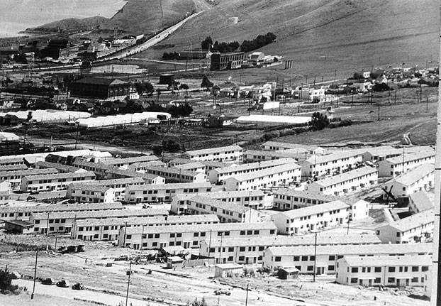
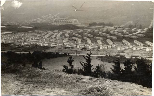
Sunnydale, designed by Roller and Stringham, was built in 1941 to house war workers. The complex unfolds on about 50 acres, its 767 single-story 1- to 4-bedroom garden-style units circumscribed by long, winding streets south of McLaren Park. The design challenge is a surplus of unstructured open space.
Sunnydale Housing Projects in Visitacion Valley, 1941.
Sunnydale housing from nearby hill with Cow Palace in background, 1941.
Photos: San Francisco History Center, SF Public Library
The philosophy was "Everything should be open, shared, so children could play" freely, says Dev, waving off distant housing design reform concepts of the '20s and '30s, which sought to eliminate disease.
Establishing "a clear hierarchy of territorial control" is her primary goal, to give each household something of its own to care for. "Achieving community isn't possible if everything is open. You need to feel your own strength; then you may be willing to reach out," says Dev.
Small visual details separate the model's attached dwellings: wrought-iron front fences and wooden backyard fences with gates, visual separation of units with color and stone trim. Sloped porch roofs replace horizontal overhangs to deflect unwelcome climbers; corner units will admit wheelchairs and strollers.
Separate front yards will extend up to the sidewalk; backyards will be enclosed completely, with access exclusively through dwellings. Stone-like walls will connect low-rise units, securing outdoor space so that "no one can run through." Underused parking lots will shrink in size, with narrowed access necks.
Conspicuously absent from redesign plans are more shared spaces. The design goal has clearly shifted to defensive enclosure: visual separation and restricted access.
Rosa Parks Senior Apartments
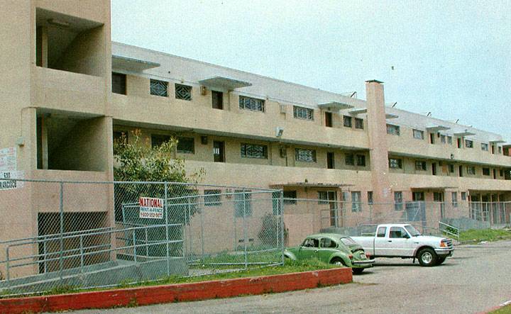
Walking toward her earlier rehab project—once the infamous "Pink Palace" on Turk and Scott streets—Dev speaks with pride of this building's transformation, from a deteriorated open-balconied family project vulnerable to outsiders, to a fully enclosed model senior mini-city with a pleasant backyard and garden.
Pink Palace before conversion to senior housing, 1982.
Photo: San Francisco History Center, SF Public Library
"The issue was how much shared space should there be," says Dev, a proponent of "building complexity into the environment to animate it." The ground floor mail area is a hub in which "you can be seen or avoid engagement," depending on the path you choose—into sunken lounge or around it, to library, sun room, garden court or elevators to apartments.
She's particularly proud of the front lobby, designed as a social congregating point, where animated banter and continually watchful eyes of residents were beefing up the security guard's patrol. Its conspicuous emptiness at midday led her to question an uncomprehending uniformed guard, with handcuffs at his hip, who escorted her to the manager's office.
The new manager reported the noise level disturbed work in his adjacent semi-enclosed office. So, quite simply, he unplugged the lobby TV and relocated it. When Dev suggested that acoustic ceiling tiles might muffle unwanted sound and preserve the lobby's original use, he laughed; alteration needs were low priority given the Housing Authority's slow response to routine maintenance requests.
Clearly, limited resources and competing needs can upset the best-laid plans.
Features of early projects withstand test of time
Not all public housing needs to be destroyed to be saved. Even a cursory look at some of the buildings and complexes that constitute San Francisco's public housing inventory shows that many have withstood the test of time as sound designs.
Early examples show particularly good design balance between shared public amenities and private space, both needed to reinforce community.
* HOLLY COURTS by Arthur Brown Jr. who also designed Coit Tower and, with John Bakewell, City Hall, 118 units, 1- to 3-bedroom, 1940. Attached, blocky two-story, low-rise garden apartments near Holly Park have stepped, interior landscaped courts and play spaces, along with small backyards. Some entrances front on the street, connecting the complex to the neighborhood. "Within the site, units create a hierarchy of private and shared spaces," San Francisco architects Gita Dev and Lisa Gelfand have written.
* VALENCIA GARDENS by William Wurster and Harry Thomsen, landscape design by Thomas Church, 248 units, 1- to 3-bedroom, 1943. In recent years, the complex's open entrance corner on 15th and Valencia streets with its cool expanse of lawn and trees has attracted the drug trade. Arcade-like passages leading from landscaped front courtyards to rear utility courts provide escape routes from police patrols, hence a plan for peripheral fencing.
Yet siting, landscaping, and functional, modern design of private and shared spaces in the three-story development balance needs for community and privacy. An early critic focused praise on "intimate outdoor sitting places," atypical for war housing, where one might get to know one's neighbors; also praised were ingenious low-budget devices for "invoking an illusion of separateness"—from varied interior color schemes to visually separate, interlocking courtyards.
Original communal craft rooms—havens for harried husbands—and vine-enclosed drying yards, complementing laundry rooms where wives conversed across shared wash-tubs, have since been modified to accommodate new shared-space needs: meetings, performances, basketball, youth and senior programs. Restoration of stone statues of animals designed for the site by WPA artist Beniamino Bufano is nearing completion.
* PING YUEN ( "Tranquil Garden") by John Bolles and J. Francis Ward, 1- to 4-bedroom, 1952. A manager of this complex refused a routine request to visit lest residents' privacy be invaded; she said there were no unoccupied units that could be shown. The six-story midrise complex facing Pacific Street in Chinatown has tiered, pagodalike external balcony corridors, a style that architectural historian Gwendolyn Wright calls "Chinese regionalism superimposed over a functionalist design." Its 234 street-facing units, built at 89 units / acre—the highest density of any Bay Area family housing project—accommodate Chinese families and the elderly. Fenced rear court play space for youngsters appears cramped but protected. The project's reputation for undisturbed tranquility contradicts accepted wisdom that highrise public housing doesn't work for families.
Ping Yuen complex in 1964.
Photo: San Francisco History Center, SF Public Library
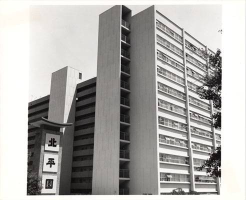
* NORTH BEACH PLACE by Ernest Born, associate of German architect Eric Mendelsohn, and Henry Gutterson, associate of Bernark Maybeck, 1952. Comparable in size and vintage to Ping Yuen, this project features low-key modern design, alternating interior courts for parking and recreation, and good surveillance from balconies of community courts.
Block 431, North Beach Housing Project before its demolition a few years ago as part of the Hope VI renovation.
Highrise housing on tight lots has proliferated for elders over the years. More generous unit cost limits have increased amenities; creative siting and scaled-back massing soften their interface with smaller-scaled neighborhood residences. Two striking examples:
* Woodside Gardens by Neil Smith and Associates, studio and 1-bedroom, 1968. Beautifully sited in a eucalyptus grove between Glen Canyon and Golden Gate Park, the 110-unit highrise blended imperceptibly into its sylvan setting before a recent balcony paint job.
* 1750 McAllister, northeast of the Panhandle, by Marquis and Stoller, studio and 1-bedroom, 1974. Sliding glass-doors, which open onto balconies, help reduce visual mass of this 11-story, 97-unit modern-style complex, as does stepped roofline and diagonal siting, angled to catch the sun better.
A time-eroded vision of public housing
Ambivalence toward public housing is hardly a new phenomenon; it has dogged government efforts to house the poor and homeless since the Depression. Amid widespread mortgage foreclosures and a building slump, home builders and bankers opposed government "competition" with private home production. But the need for government intervention was clear: "The primary cause of the "housing problem,' " observed housing activist Catherine Bauer, "is a simple economic fact: ordinary private enterprise is unable to provide adequate new housing at a rental or sale price that families in the lower or middle income group can pay. The situation is permanent."
The fledgling public housing agency (titled U.S. Housing Authority) was faced by a monumental task: building 15 million dwelling units over 25 years. Unfortunately for the subsequent history of public housing design, the sheer scale of this undertaking resulted in institutionalizing mass production mechanisms—numbers crunching—vs. good design aesthetics, however this is measured.
Design standards, per se, were not part of the 1937 Housing Act, much of which was written by Bauer. Neighborhood planning ideas popular in the '20s were also stigmatized by private development interests as socialistic. The government's housing mission—creating new units and demolishing equivalent numbers of old—became narrowly defined.
Bauer, who left Washington for California and married Bay Area architect William Wurster, finally broke ranks with public housing advocates in 1957 when she lamented "The Dreary Deadlock of Public Housing" in Architectural Forum. A political pragmatist, she recognized that public housing had never attracted widespread support, both because of regulations excluding many working families and because of its design as something set apart from the way most people lived. It had become distinctly unhomelike.
"The reaction against chaotic individualism and the wasteful crudity of the ubiquitous gridiron street pattern was long overdue," she observed. "But in grasping for modern principles of large-scale community design, we embraced too wholeheartedly functionalist and collectivist architectural theories that tended to ignore certain subtler aesthetic values and basic social needs. . . . The mistake . . . was to jell both policy and practice in rigid formulas that prevented further experimentation. . . .
Her prescription: more experimentation with forms and funding mechanisms. A number of public-private affordable housing programs of the '70s and '80s have, in part, addressed these lacks.
Today our ambivalence toward public housing is certainly linked to widespread evidence of government failure, as houser of last resort, to produce for millions of public housing residents even a semblance of the fading American Dream. We are more aware, too, that bricks and mortar alone don't build—or protect—community
But the loss of low-rent private urban housing stock in the '70s and '80s, through gentrification and commercial development, and the proposed dismantling of HUD has made preservation of public housing units ever more urgent. At a time when "privatization" is a buzzword, and homelessness is epidemic, the best efforts of public housing designers, administrators and residents to reconcile contradictory needs and insights take on poignant significance.
Originally published in three parts in the San Francisco in May, 1995.

